I think the main problem with using non-tree graphs isn't the choice to use the graph; it's the lack of definition for the edges. Most people, when they first reach for a non-tree graph, choose to weaken the definition of the edge even beyond what is implied by tree edges, which usually means "owns" or "contains" or the like. By default, an edge in a non-tree graph simply means "relates to, somehow". And a beginning user faced with a bunch of nodes are just going to draw a bunch of lines between topics that seem to tangentially relate to other nodes, until they get the big hairball.
If, however, you get stricter about the definition of the edge in a graph, they're superior to trees in many contexts. An edge might mean "predates", or another edge might mean "implies". Those are the two main definitions I use, because when needing a graph I'm usually either thinking of planning (prerequisites, when some things need to be done "before" another), or I'm thinking of arguing/concluding (where some things when combined "imply" a conclusion). It doesn't really work to conflate the two.
You can also combine multiple edge definitions into one graph, and maybe it'd look like a hairball if you're displaying all of them at once, but if you filter it gets more useful.
Two more things... graphs almost always, in my experience, are more visually useful when they are directed, whether acyclic or not. Radial just doesn't seem to have much added benefit. And, a pet peeve is mine is when people use radial UX to display a tree and then call it a "graph". I know, it's a picture of bubbles and arrows, so it's a "graph" in that sense, but most bubble graph software doesn't even support graph data structures. If you grab one bubble and apply gravity, it just shakes out into a tree.
Oh yes, edges of different types and their direction are definitely what the author of the post was missing.
This is precisely where triple (hyper) graphs and the idea of semantic networks comes in. Unfortunately, the designs, architecture and implementation of the semantic web are all completely impractical garbage.
I did a lot of research on rendering ontologies and in general the best way to do so is not at all. Instead try to do domain specific bijective projections (akin to DSLs). And if you really need graphs do not render the edges. It always leads to chaos, it is better to show all vertices and only display edges on request (e.g. on hover).
I wrote a dictionary system based on graph, the graph itself isn't being displayed. I agree RDF is garbage tech, it's easier to do something without it.
The solution is came with to display content from a given node is first to group neighbors nodes by the type of their relationship. Each vertex and relation type has a dedicated component for display and if not, uses a default one. The display order of relationships is set with configuration.
It very simple yet powerful system, that was implemented on mobile and web. I've prototype of very cool stuff (like a Chinese dictionary, and another multilingual one) but none very completed because most of more senior researchers I worked didn't see the point.
Your approach doesn't apply to the semantic web. Apples and oranges. Two dimensional non-tree graph are neat but in most cases at best a debugging tool or whirlygig.
I mean semantic web is designed to turn the entire web into a semantic database. You could treat "your" parts of the web as DSLs in the simplest possible RDF/linked data and then link it to semantic web concepts (and other people can link it as appropriate), but I don't think you can create anything like a semantic web with standalone DSLs.
> That is what I was saying. Layouting and rendering general case graphs is a mess.
Yes, unfortunately and somewhat ironically since the web is a non-tree graph.
Knowledge graphs are traditionally collections of triplets, 2 vertices/entities plus edge type/relation. They are vastly superior to trees for data representation, but are completely useless for visualization. There is no meaningful question that can be answered faster or better by looking at the drawn edges - just print a list of entities and add hyperlinks.
There are plenty of meaningful questions that can be answered by focusing on one edge meaning at a time, though.
Call graphs (edge: this calls that), pert charts or dependency charts, (edge: this is required by that or this enables that), recipes (edge: do this before that), arguments/conclusions (edge: this premise combined with that premise implies or justifies that lemma), etc, etc. All of those are very useful to look at visually.
Graphs are neat. For your own notes or for heavily interconnected stuff. Like hypertext. The actual graph visualization is often just eye candy. Eye candy that makes nerd-hearts melt, but ultimately a list of related topics (and a single sentence describing that relationship) is much more powerful than seeing a word cloud or a complex graph.
If your topic is of the nature that there is (or should be) a logical starting point, graphs decrease the chance that interested people get presented information in the right order. If there is no logical starting point or there is no right order: good, so be it.
As someone who wants to like graphs: Graphs are great for organizing personal information, meaning they are great if you make the connections. However in practise graph-centric solutions are often solutions in search of a problem. And if you use graphs (anybody using hyperlinks to other hierarchical levels does) they shine most if they don't take the center stage, but are presented on purpose at specific spots.
I have built a few graph views and worked on a tool used to specify graph views for existing schemas. My thoughts.
Hierarchical views aren’t easy because they are common, they are easy because it matches how humans think on a basic level. We take a concept, draw a line down the middle, and get two refined concepts. That cleaving is a natural process that produces hierarchical trees. If you can display your data in a tree, you have the optimal view most of the time.
The trick isn’t finding a better graph. The trick is making your data look like a tree.
Don’t confuse your schema and your view. Your schema will almost always be a cyclic graph. But if you define an arbitrary root node and choose a subset of relationships, you can easily create a hierarchy view of a subset of the graph.
All generic nontree views suck beyond a certain complexity. Unless you have a specific kind of cyclic data and specific rendering, it will look bad. The issue is that there is one type of shape for acyclic hierarchical data, the tree, but infinite for cyclic data. If you are displaying cyclic data well, the graph has been tuned for the use case. Drawing cyclic graphs is an NP hard problem, and you need to choose heuristics to layout the nodes.
The best graphs views are a lot more than lines and boxes. They facilitate specific jobs, and surface key information and actions. When nodes have heterogeneous types they may need their own renderings beyond simple styling. Just drawing words with connecting lines provides shocking little value, especially for those who aren’t spatial thinkers.
To add to that, some people really like graphs and some don’t. No graph will be good enough to get a graph hater to like it. So any time you display a graph you need an alternate view, like a list. And that brings us back to hierarchical trees.
Graph visualizations are more useful for data science than end user tasks.
Even in lower cardinality contexts like music genres users are better served by traversing topics through a similarity mechanism (e.g. list of suggested other topics) as it gets to user benefit sooner. How often are users clicking far away topics from their area of interest? How do they know which direction to travel in?
Sufficiently large graphs are always subject to classification mechanisms of human benefit and cardinality. That means most graphs are best accessed through hierarchical interfaces.
One interesting thing is the weights of classification, e.g a band could play multiple genres but are they more representative of some than others. This might benefit from a creative interface to represent how dimensionally similar a topic is to some ideal entity in each classification value. Possibly a graph?
Just don’t. There’s no real use case where people need to perceive this graph. It’s embarrassing to see the dreadful redesign of the C2 wiki shown here - the original wiki, no less! - which basically made it unusable. Hypertext is one of the most successful UI paradigms of all time, don’t overthink it.
At least as of, err, 10-ish or 20-ish years ago, it seemed to me a key issue was a dearth of code - a severe disconnect between research literature and available FOSS code.
For example, to preserve user orientation, you'd like a graph's presented layout to remain stable during user interactions and edits, rather than being needlessly, repeatedly, and extensively rearranged. There were lots of research papers and prototypes on ways to do that nicely, but crickets for code.
Now imagine you want to implement a GUI app, and it turned out "well, first you'll have to implement bitblit, and then line drawing, and ...". You might get articles "Why don't we display apps as a GUI?".
As someone who finds it deeply puzzling that people so prefer trees to directed graphs, it was frustrating.
The article ends with classifying the challenge as a UI problem and doesn't explore the underlying logical design which is not a UI problem.
As the author identifies, a graph of all permutations is useless to a user.
And, as the author identifies, a hierarchy provides some organization.
Hierarchy and graphing are not equal. Hierarchy is a subset of graphing, where binary weight has been applied to the direction.
For example, given the set [Foo,Bar], we get the graph with equal weights.
Foo <---> Bar
If we want a hierarchy, we give full weight to the edge:
Foo ---> Bar
Given a set and a graph with a weighted edge, we have a direction.
The challenge is to dynamically weigh the edge. In reality, an edge with a binary weight is useless. For example,
Foo <10%------90%> Bar
is a more realistic weight, as in computer programming Foo Bar is almost always the intent, unless the intent is to search a `.Reverse()` method, in which case Bar Foo makes more sense and the most common weight is not valid.
However, to the author's point, neither the programmer nor the user know the optimal direction between vertices to arrive at the ideal path. The challenge is to generate a state machine in which the weights are dynamically adjusted as the user navigates the graph, resulting in the optimal direction. The best we can do is to analyze the input of other users to generate weights. "Crowd-sourced" weights.
> The challenge is to generate a state machine in which the weights are dynamically adjusted as the user navigates the graph, resulting in the optimal direction. The best we can do is to analyze the input of other users to generate weights. "Crowd-sourced" weights.
I think you are right on point 1, but point 2, perhaps we can generate the weights for te individual user, by asking a (very) few simple 'onboarding questions' that help generate the hierarchy that would suit the user?
You sometimes see sites reaching for this kind of approach with the 'For user type X', 'for user type Y' top-level navigation - but this then just leads to multiple static heirarchies.
In the context of LLMs, graphs or their simpler cousins - trees are surprisingly good as both inputs and outputs.
My team builds LLM-based features as part of our b2b SaaS product.
The primary challenge is how to get fuzzy, incomplete, heterogeneous business knowledge into LLMs and do something useful with it. Trees have been excellent. Even simple cases like summarizing content, there is a big improvement in relevance, accuracy and precision.
Graphs work really well for displaying relational data if you can get labels on all (or most) of the arrows and you can zoom in / change perspectives to see different relations between the same nodes.
Graphs with unlabeled arrows can still be useful, but not without someone there walking you through what the arrows mean. Otherwise, when embedded in an article, they're not much more than stock imagery.
The funny thing is that the web has always been (by definition) a "Content as a Graph" (of interlinks). It is just not "displayed," or rather, it is displayed sequentially, as though we zoom through the graph's edges themselves. There's no extensive overview, but that might be precisely what makes it so mentally unburdensome.
I agree. I wanted to explore "graph pageing". The problem with computer screens and large graphs is that they're awkward to navigate because the viewport is smaller than the graph, and you can only scale the entire graph so much. You could pan around a large graph but it is not ideal, it's kind of awkward.
I wrote a graph layout algorithm here but it makes no attempt to prevent overlapping.
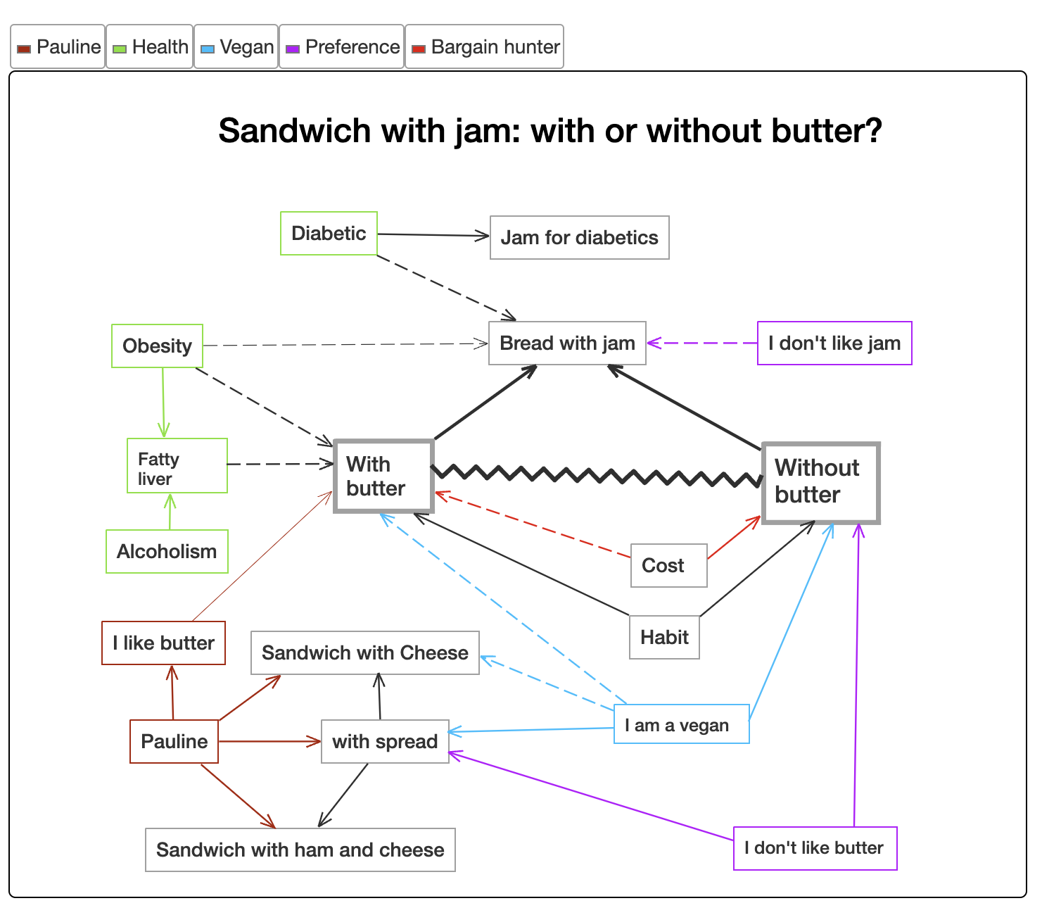
You might be interested in this tool[0], which focuses on communicating the relationships between ideas. [1] is an example "graph" discussing the topic of "bread with jam or not" (just to showcase the idea). This page [2] contains more advanced content graphs with more descriptions.
imho as a reader a proper lattice (see concept lattice) is useful. Everything else is typically less helpful than it could be. I don't find network graphs like those usually produced by "second brain" tools that useful at all. Even Niklas Luhmann, who largely inspired this networked hypertext approach with his analog zettelkasten imposed enough structure through meta notes and special linkages such that browsing at a particular node could be more hierarchical latticeesque and directed. Browsing pure undirected networks is usually not super useful when it comes to fashioning structured understanding precisely because such an object almost completely lacks structure. Perhaps a set (sans any linkages) is perhaps the only other object with less structure than the undirected network.
By default a large graph looks like a “hairball” when you graph it.
Most people in the biz are aware of this but somebody junior always comes around with a meaningless hairball and they can’t understand why people treat them the way a crypto enthusiast gets treated at most parties.
Wikipedia has categories that from what is perceived, should form a DAG (Direct Acyclic Graph). But very often they don't. I saw this with my own eyes when tried to implement "DagView" (a visual control trying to navigate DAGs similar to trees). So you keep opening sub-categories and one of them suddenly is a super-category noticed before. This indicated for me that despite the fact that DAGs have luxury of having many "parents" it doesn't make things easy in the heads of those who try to work with them. Probably our brains are not very good at dealing with non-hierarchical structures
The article mentions Glenn McDonald's musical genre page (https://everynoise.com/, no longer refreshing with new Spotify data) as an example of a flexible graph-like exploration format, without being burdened by explicit connections.
The author also has a thorough description of pros and cons of the general concept.
I guess we’re used to dealing with non-hierarchical data in real life. I have a shelf of books, some list of movies, and a stack of documents.
Popular platforms are already prioritizing “recommended” views (as opposed to nested or hierarchical lists). With ai assistants and vr becoming more popular, I could see graph UIs following too.
If human systematics for .. let's go with the last 1000+ years has tended to not do this, biblical concordance and the Talmud/Kabbalah aside, why would you deliberately walk away from the simpler abstraction?
That said, "see also" links are basically making graphs out of trees.
This is a great article and fun to see fundamental concepts get (re)discovered here!
A perspective that we can generalize from the hierarchy discussion is to think about tool-for-the-job: what is the 'content' job, and what 'jobs' do graphs do well? We think about this a lot as we work on problems like how to make it easy to explore 100,000X+ more relationships on screen than they're showing: https://github.com/graphistry/pygraphistry .
First, what do graph visualizations do?
- They let us see the relationships in data. The article discusses hierarchy. But there is also progression, root cause, scope, and basically any correlation/causation relationship ML/AI figures out. There are many interesting relationship questions that pop out as soon as you logs, tables, events, etc!
- They let us directly manipulate the nodes & edges, such as for drilling down, navigating, reclustering, etc.
- A useful 'aha' is thinking of modern information visualization as trying to optimize some sort of time-to-insight through a sequence of visual interactions. So each view must be information dense for visually revealing certain insights, and make it easy to get to the next set of visual Q&A.
- Ex: When the entities are the interesting thing wrt questions, being able to drill down into individual nodes/edges into great dedicated views becomes important, so graphs should often be multimodal. And if the relationship aspect is unimportant... then using graph view hurts more than it helps.
- From optimization perspective, it now makes sense to specialize for specific domains. Maybe what is needed is more of a small diagram, and not actually investigating a lot of relationships. Or a graph of subway stops, which has additional visual considerations. For a website, a sitemap navigation vs clickstream product analytics view would likewise need
A good analogy is a map. Sometimes exploring Google Maps is great, and you drill into a business inspector sidebar or down to a street view. But other times, it's better to have the map embedded into Yelp.com restaurant entry when you just need a quick view of mapping information as part of some broader context. Or you don't care about that map at all and can skip it.
Given all that.. it's interesting to revisit asking... what is the 'content' job to be solved? What kinds of content lean towards graph, and which don't?
If, however, you get stricter about the definition of the edge in a graph, they're superior to trees in many contexts. An edge might mean "predates", or another edge might mean "implies". Those are the two main definitions I use, because when needing a graph I'm usually either thinking of planning (prerequisites, when some things need to be done "before" another), or I'm thinking of arguing/concluding (where some things when combined "imply" a conclusion). It doesn't really work to conflate the two.
You can also combine multiple edge definitions into one graph, and maybe it'd look like a hairball if you're displaying all of them at once, but if you filter it gets more useful.
Two more things... graphs almost always, in my experience, are more visually useful when they are directed, whether acyclic or not. Radial just doesn't seem to have much added benefit. And, a pet peeve is mine is when people use radial UX to display a tree and then call it a "graph". I know, it's a picture of bubbles and arrows, so it's a "graph" in that sense, but most bubble graph software doesn't even support graph data structures. If you grab one bubble and apply gravity, it just shakes out into a tree.