I believe the bounding box has to fit all the possible ascenders and descenders etc., so the em-height is proportioned within the box to whatever the highest and lowest marks in the typeface are.
But this technique isn’t correcting for some kind of mistake the typographer theoretically made, it’s adjusting for the fact that CSS sizes by the bounding box instead of the em-height. The font itself is unchanged and renders exactly how it’s designed, this just lets us use it in a more intuitive way.
IMO sizing by bounding-box was the wrong move in the original CSS spec, but that’s how digital type renderers have worked going back to the eighties, so the whole thing was probably too entrenched in the first place. And I have no idea if font standards of the day even had em-heights encoded in a way that could be read in font metadata.
Anyway, this whole feature is news to me, can’t wait to try it. Between this and text-box-trim (life changing), I’ve never been happier with web design.
> I believe the bounding box has to fit all the possible ascenders and descenders etc., so the em-height is proportioned within the box to whatever the highest and lowest marks in the typeface are.
I wish it were this simple.
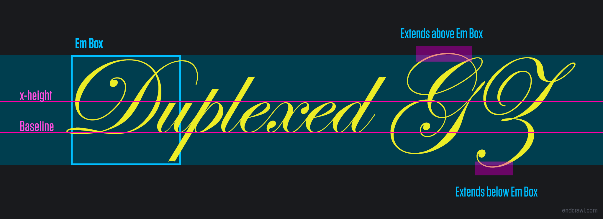
The em square != the bounding box of all glyphs. The em square is defined by the font's ascent & descent vertical metrics, which are set by the font designer.
There are reasons why you might want glyphs to escape the em square. Perhaps you're typesetting English text without accent marks above capitals, and using the bounding box's vertical maximum would introduce too much line space. Or perhaps you're using a decorative font which is designed to escape the em square, and potentially even overlap the em squares of lines above and below, like this: https://alangrow.com/images/blog/script-font-escaping-em-squ...
To make matters worse, and mostly for legacy reasons, there are THREE different sets of ascent & descent metrics in a font file. Which is used depends on your OS and the software rendering the font. But the Webfont Strategy described here is a nice one, because you can use the bounding box (winAscent & winDescent) if you really need to, say because any glyph might be used and you want to avoid em square escape: https://glyphsapp.com/learn/vertical-metrics
But this technique isn’t correcting for some kind of mistake the typographer theoretically made, it’s adjusting for the fact that CSS sizes by the bounding box instead of the em-height. The font itself is unchanged and renders exactly how it’s designed, this just lets us use it in a more intuitive way.
IMO sizing by bounding-box was the wrong move in the original CSS spec, but that’s how digital type renderers have worked going back to the eighties, so the whole thing was probably too entrenched in the first place. And I have no idea if font standards of the day even had em-heights encoded in a way that could be read in font metadata.
Anyway, this whole feature is news to me, can’t wait to try it. Between this and text-box-trim (life changing), I’ve never been happier with web design.